|
当我开始设计一个网站,通常是向后制作的。我最开始设计的是站中最细微的部分:一个故事描述的页面或是一个搜索的结果页。然后我开始设计容纳这些细小部分的页面:索引或是页面集中的区域。接下来所要做的就是最后的步骤——首页。
我之所以这样制作的原因是每个容纳页面都需要有预期加入的适当内容。如果首页表达的是一件事,但扩展开的页却是描述了别的内容那就会误导使用者。
这还意味着,当你的工作转移到首页的时候,大量的任务已经完成。所有制作上的顾虑都来到了头部——在首页上(简单的讲,在制作首页时已经是整个网站制作的收尾工作了)
公司站点的首页得多花点心思。首页是你给别人的第一印象。就如一句老话,你只能得到一次机会。所以首页得有一套独特的设计目标
在我进入目标前,这还有一些有趣的现象。每个我所工作过的站点都有惊人相似的流量趋势,而且还有一点是特别突出的。还记得我前面所提到的那写最细小最底层的元素吗?这就最基础的元素——在一个新闻站上它就是详细的新闻内容页,搜索引擎中它就是结果的显示页,在产品目录中它就是详细产品页。这类页占整个站点中所有浏览页的60%到75%。其余的就归首页了。
这并不是说首页不重要——第一印象是非常重要的。但你看看数量就会发现这些底层元素是多么的庞大。
就是说,让我们观察呈现独特性首页的挑战。要记住,我所提到的首页是指在任何.com上存在的首页。第一页就好比是你家的前大门一样。
任何首页都应该具备以下四个要求(真正优秀首页应该达到的目标):
目标 1:回答这个问题,“这是什么地方?”
就是这个,不论是什么网站这都是首先要完成的任务。如果你忽略了它那就意味着你将访问者遗弃在混乱中。
一位新到的访问者首先会做的事就是从并不熟悉的站点上得到这个答案。如果站点不能成功地在几秒内完成这个任务,就会使访问者无语(就是这个“.......”),然后就是离开并再也不会回头访问了。当你遇到某人给你的感觉像个蠢货的时候你会怎么做?你还会要想到再去粘着这个人吗?
这就是关于制造良好第一印象的全部
别不好意思去用那些老掉牙的话:“我们是谁,和这是关于什么的。”然后连接到一些更唠叨的关于页面或是浏览页。这样,需要这类帮助的人就有了去向。注意你使用的文字要让读者感觉到是重要的。
当然要避免过于罗嗦。让你的文字举足轻重。但解释必须出现在页面的顶部——这是你得到回头客的重要办法。
公司尝试做新的事物前有些事是特别重要的。像Google之所有可以不用在首页上不加任何说明是因为几乎人人都会使用它。但这只是个例外。如果你正在做一些新东西,有些时候你只要做下简单的解释就行,像:Flock 是一款免费的,并且是开放源码的WEB浏览器
如果第一次来你站点的人不能在首页三秒内明白这是什么样的站点,第一个目标你就失败了,只有人们知道这是什么站点才会使用它。
| 热门推荐: |
与你分享黑客的十大锦囊妙计 |
网吧主页服务器的配置详解(图) |
目标 2:不要让访问者反复走老路
第二个目标是为那些已经知道他们在做什么的人而准备的。这些用户就和你一样,他们是站点的熟客。
要达成前两个目标有个很好的技术——让页面的一部分区域动态化。这个区域可以给新来的访问者显示解释信息。当用户一旦登陆或就会用其它信息来替换它。
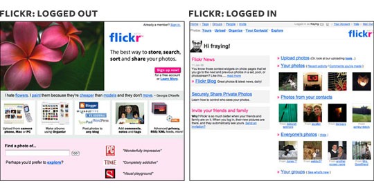
Flickr很好的体现了这个方法,给不同的用户(登陆过的、没登陆过的)提供了完全不一样的首页。。。。

目标 3:展示更新内容
当你开始面对目标三的时候,你已经提供给所有用户(新手或老手)所需要的,祝贺你,现在所有的用户都在同一页面上了(对站点认识都一样了)!现在是时候让他们知道站内的新加内容。
有很多站点都做到了第一和第二目标。但一旦用户在阅读方向上出现麻烦时意味着你少做了些事:更新部分。作为站长你当然比访问者了解你的站点,所以做他们的导游吧。给点地方推荐,注释哪些是新内容。Blog在这方面做的很出色
目标 4:提供一致,可靠的导航系统
这是全站都应该达到的目标(不光是首页),放在这的原因是希望你能将首页显示的导航带到所有的页面上,比如在尾部有六个连接,那这六个连接应该在每个页面的底部出现。
When I set out to design a website, I do it backwards. I start with the design of the smallest, deepest element: the story page or search results. Then I work backwards to design their containers: section pages, indexes. Then, lastly, I work on the home page.
I do this because each container needs to adequately set expectations for what it contains. If the home page says one thing, but the internal pages say another, that’s going to lead to a user-experience failure.
This also means that, by the time work begins on the home page, there’s a lot of momentum going already. And any lingering anxiety is going to come to a head—on the home page.
Home pages are anxiety-inducing for companies. The home page is your first impression. And like the old saying goes, you only get one chance. So home pages themselves have a unique set of design goals.
Before I get into those goals, here’s a grain of salt. Every site I’ve ever worked on has had strikingly similar traffic trends, and one stands out. Remember that smallest, deepest element I described earlier? This is the atomic element—for a news site, it’s the story page; for a search engine, it’s the search result; for a store, it’s a product page. This page accounts for 60 to 75 percent of all page views on the site. The rest belong to the home page.
This is not to say that the home page is unimportant—it’s hugely important as a first impression. But looking at the numbers, you’ll get far more bang out of tweaks to the atomic element pages than the home page.
That said, let’s look at the unique challenges that home pages present. Remember, when I say home page, I mean the page that lives at whatever.com. The first page a user sees when they show up at your front door.
Any home page has four main goals, in this order:
Goal 1: Answer the question, “What is this place?”
This is, and always will be, the number-one job of any home page. If you ignore this goal, you’ll leave new visitors in the dark.
The first thing a new visitor does when they get to an unfamiliar site is ask that question. If the site does not do a good job of answering it within a few seconds, the user will feel dumb, leave, and never come back. After all, what would you do if you met someone and they made you feel like an idiot? Would you want to hang out with them again?
This is all about making a good first impression.
Don’t be afraid to use good old fashioned text to say: “This is who we are, and this is what we’re about.” Then link to a more verbose about page or tour. That way, the people who need that help have a place to go to find it. And make sure the text you use is excited and positive—and makes the reader feel important.
Don’t be too wordy, of course. Make sure all the words you use are doing heavy lifting. But the explanation has to begin at the top of page one—it’s the most important thing you can do to turn newbies into repeat visitors.
This is especially important for companies trying to do new things. Google can get away with a user-hostile front page because everybody already knows how to use it. But that’s the exception to the rule. If you’re doing something new, sometimes you just have to explain it in plain language, like: Flock is a free, open source web browser.
If a first time visitor to your site’s home page does not understand what it is within three seconds, you’ve failed goal number one, so feel free to skip the rest. The only people who will use the site are the people who already know what it does. Or, ya know, masochists.
Goal 2: Don’t get in the repeat visitor’s way
All that said, the second goal is to get out of the way of the users who already know what they’re doing. These are the users like you, the ones who have been here before and already get it.
One great technique that accomplishes the first two goals in one fell swoop is to make one area of the page dynamic. That area can show an explanation to newbies. But once the user is logged in, replace the explanation with some information specific to that user (which also meets goal three).
Flickr takes this method to an extreme, providing entirely different home pages if the user is logged in or logged out. For them, this is a perfect method. The site is so customized for logged in members, and the service is just different enough from other sites, it makes perfect sense to provide an entirely different experience to each group, and it perfectly meets goals one and two.
Goal 3: Show what’s new
By the time you get to goal three, you’ve already addressed the needs of newbies and repeat visitors. Congrats, now everybody’s on the same page! Now it’s time to impress them all with what’s new.
Too many sites stop after addressing goals one and two. But once a user’s gone through the trouble of figuring out what you do, and then actually coming back, you owe them something: what’s new. You know your site better than they do, so be their tour guide. Suggest places to visit, starting with whatever’s new. Blogs are especially good for this, with their newest-comes-first formatting.
Goal 4: Provide consistent, reliable global navigation
This is a site-wide goal, but it’s important to list here because the expectations you set on the home page will carry forward to every page on your site. It’s the little things that count here. If a link is in the global navigation on the home page, it should be in about the same place everywhere. If there are six links in the footer, those six links should appear in every footer.

【责任编辑 徐洋】
|

